Song Gao
University of Wisconsin-Madison
Mapping Human Mobility OD Flow Changes in the US during the COVID19 pandemic
Understanding dynamic human mobility changes and spatial interaction patterns at different geographic scales is crucial for monitoring and measuring the impacts of non-pharmaceutical interventions (such as stay-at-home orders) during the pandemic. In this blog, an up-to-date multiscale dynamic human mobility flow dataset across the United States is introduced, with data starting from January 1st, 2020. By analyzing millions of anonymous mobile phone users’ visit trajectories to various places provided by SafeGraph, the daily and weekly dynamic origin-to-destination (O-D) population flows are computed, aggregated, and inferred at three geographic scales: census tract, county, and state. There is high correlation between this mobility flow dataset and other openly available data sources, which shows the reliability of the produced data. Such a high spatiotemporal resolution human mobility flow dataset at different geographic scales over time may help monitor epidemic spreading dynamics, inform public health policy, and deepen our understanding of human behavior changes under the unprecedented public health crisis. This up-to-date O-D flow open data repository (https://github.com/GeoDS/COVID19USFlows) can support many other social sensing and transportation applications.
The directly detected mobile phone flows account for about 10% to the entire population in the U.S., and the sampling ratio of unique mobile devices to population varies across different neighborhoods. Therefore, we aim to infer the short-term population-level dynamic mobility flows during the COVID-19 pandemic as it is important to accurately estimate meta-population infection cases and in other human mobility applications. To do so, we utilize the official ACS population demographics with active mobile phone visitor patterns to extrapolate the population scale flow. We also compare the derived results with two popular human mobility models: the gravity model and the radiation model (more methodology details in the data descriptor).
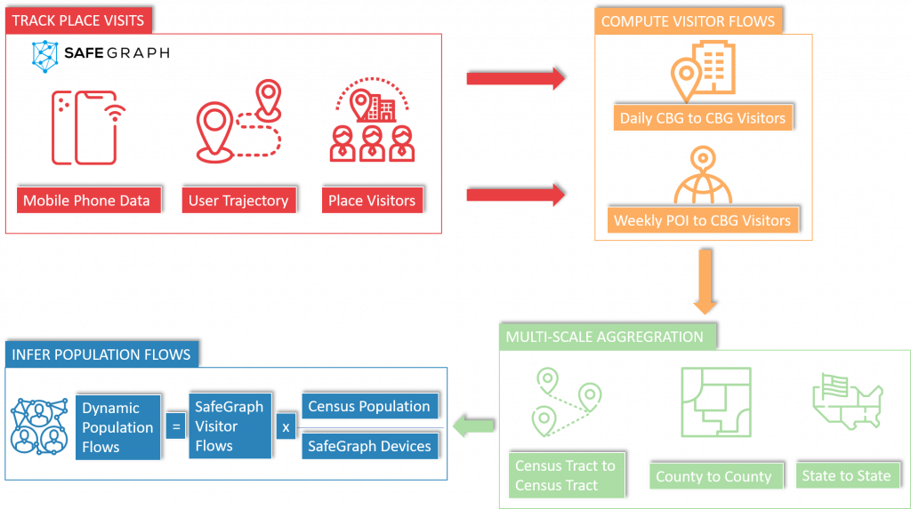
Figure 1. The data processing framework for the mobility OD flow dataset production.
Figure 2 shows the temporal changes of the total number of mobility flows in five metropolitan areas: New York, Los Angeles, Chicago, Houston, and Seattle. Accordingly, the daily flow data provides a more detailed temporal pattern description of human mobility changes compared to the weekly flow data. The temporally-changing curves have more fluctuations over time as human mobility patterns might be influenced by various factors and individual events (e.g., statewide lockdowns, presidential primary election day, Memorial day, or street protests), while weekly flow data reflects more general mobility patterns; the temporal curves for the weekly flow data are more smooth and stable in comparison to the daily flow data. For example, people may not visit the supermarket everyday and therefore the visitor volumes may vary by day of a week, while the sum of volumes in one week is more stable.
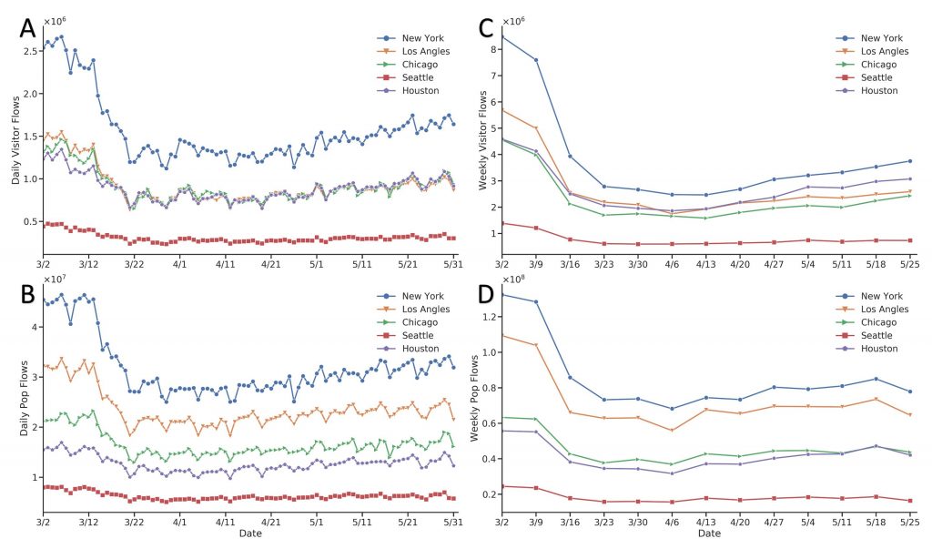
Figure 2. Temporal patterns of mobility flows in five metropolitan areas: New York, Los Angeles, Chicago, Seattle, and Houston. (a) daily visitor flows; (b) daily population flows; (c) weekly visitor flows; (d) weekly population flows. Date range: from March 2nd to May 31st, 2020.
Figure 3 shows the spatial patterns of O-D flow changes during the COVID-19 pandemic based on the weekly flow mobility data. Figure 3a and 3b show the spatial interaction patterns of population flows across the Contiguous U.S. at the state and county scales, respectively. Figure 3c shows the population flow patterns at the census tract scale in the New York metropolitan area (New York was selected as it had the most confirmed COVID-19 cases during the study period). We take four weekly flow data to represent the spatial patterns of mobility flows before (March 2nd to March 8th), during (April 6th to April 12th), and after (May 11th to May 17th and May 25th to May 31st) the stay-at-home orders. At all three spatial scales, the movement flows decrease significantly from March to April due to the stay-at-home orders, with certain increases in May with the start of state partial reopenings. The decrease and subsequent increase in human movement flows clearly show how the outbreak of the COVID-19 pandemic and social distancing-related policies affect human mobility changes. In particular, according to Figure 3b, during the stay-at-home order period long-range spatial interactions decrease to a small quantity, while most human movements appear as short-range movements to the adjacent counties. When cities begin to reopen in May, long-term spatial interactions gradually rebound at both state scale and county scale.
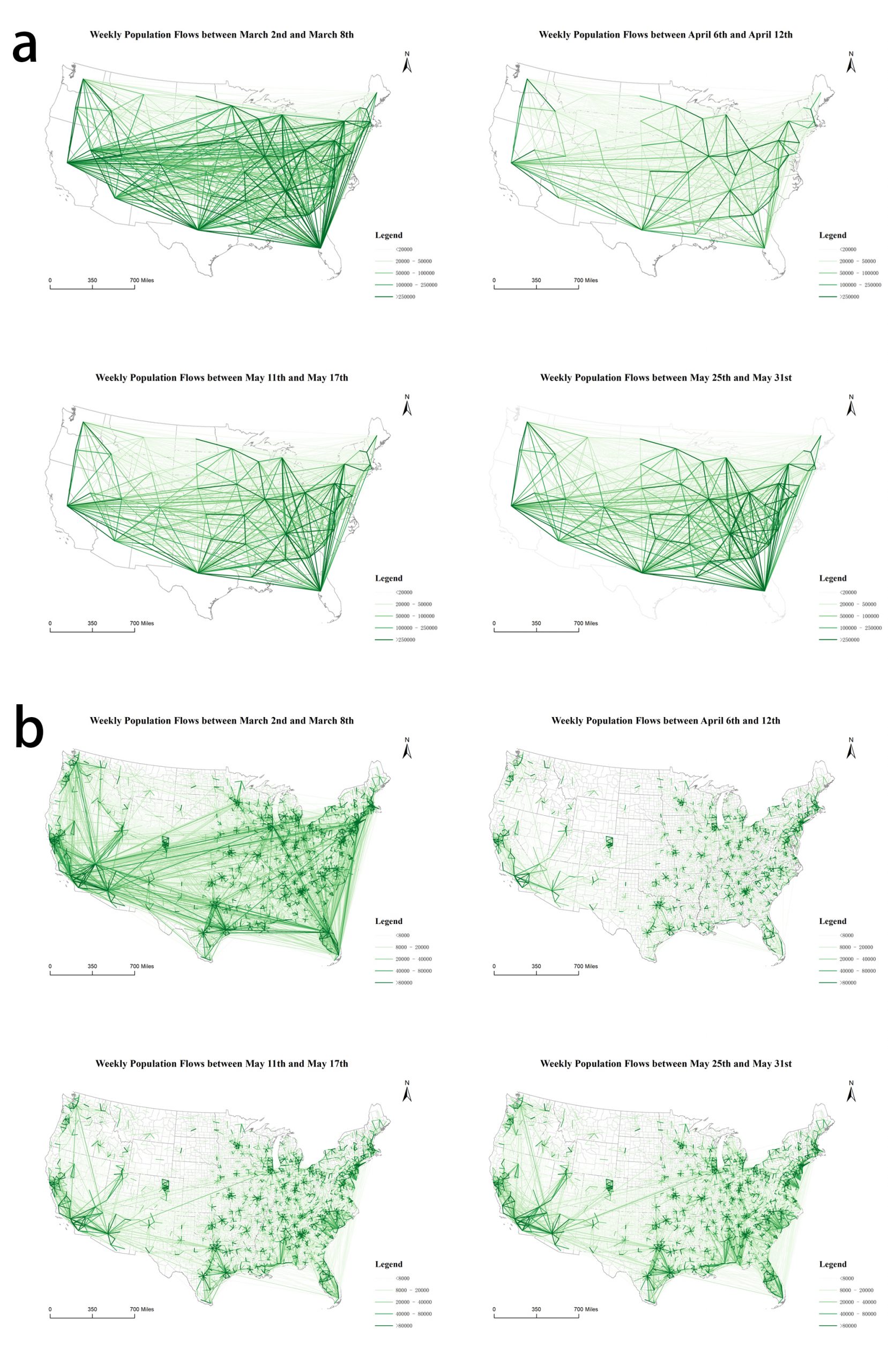
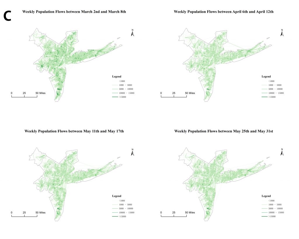
Figure 3. Spatial patterns of mobility OD flows before (March 2nd to March 8th), during (April 6th to April12th), and after (May 11th to May 17th, May 25th to May 31st) the stay-at-home orders at three geographic scales: state-to-state, county-to-county, and tract-to-tract.
